
art analysis #1
03-05-26
I’ve been working on a new body of work that will be part of a solo show in July. In preparation, my professor tasked me with studying some artworks and their accompanying artist statements.
I pulled most of these works from Transcending Tradition: Selected works from The Bennett Collection of Women Realists. The book features tons of paintings; each has an accompanying artist statement on the piece’s subject matter, inspiration, and/or process.
Any other artworks were pulled from the Bennett Collection website, which includes artist biographies but lacks statements on specific pieces.
At some point I will take these notes and write out a formal analysis to post on my blog.
So Obviously True, it’s One Girl, Not Two
Anna Wypych
Oil on canvas, 2014

- Inspiration from Paolo Ucello’s Saint George and the Dragon
- dichotomy of calm, composed girl and dragon
- dragon-like nature transposed onto portrait
- Hume’s bundle theory
- “the ontological theory about objecthood in which an object consists only of a collection (bundle) of properties, relations or tropes.” (Wikipedia)
- an object is but a collection of its properties; there is no object without properties
- not sure what “properties” are displayed to correlate with the figures…what purpose do all the miscellaneous items serve besides framing, and parodying classical still-lifes?
- links to Buddhism—can be likened to causes and conditions, impermanence
- also look into:
- “just like the universe according to Heraclitus” — comparison derived from bundles, or multiplication?
- chiaroscuro inspired darks
- conceptual “weight” within the painting, if not explicitly known to viewers; theory informs geometry
Has an almost theatrical feel. Figures feel like characters/actors/archetypes. Colors derived from medieval inspiration. Tea candles are a nice almost satirical touch. Body language is expressive.
Not sure if the still-life materials do it for me; feels like actual clutter, not just visually. Also idk how the Ucello painting is transposed other than “there is a girl and a dragon” lol. (Look into the story/themes/context behind Saint George and the Dragon?)
Unsure if all the concepts come together but I like the thought process behind the piece—gives me ideas for applying philosophies to my own work, and a reminder to specify without revealing—I guess the visual equivalent of “show don’t tell”?
Dirty Laundry
Katie O’Hagan
Oil on linen, 2013

- Emotional metaphor to illustrate life event (divorce)
- Literal setting informed by small town background (atmosphere, feeling—history)
- “It was the best way to convey the level of vulnerability and exposure I felt at the time.”
This painting is less interesting to me. Too individual and autobiographical? More “identity” based than not. I think I prefer universal metaphors and generalized figures, whose identities are either completely anonymous or otherwise oblique. Also, the setting/composition is kind of cliche and tired.
I guess I don’t mind identity-focused art. But if you’re going to do it, make it interesting (see White Fives below.) I mean, Cindy Sherman is one of my favorite artists ever—her Film Stills series totally molded how I view portraiture in art.
I suppose, then, I am not necessarily anti-identity; I just don’t like literal identity. I prefer the abstraction of identity. Sherman’s photographs have specific portraits. But they are not literal depictions.
And there is a gradient to abstraction—this work isn’t enough for me.
See her painting, Resistance, for something more my style—
Resistance
Katie O’Hagan
Oil on canvas, 2017

- stronger visually and metaphorically than its 2013 counterpart
- composition arranged in a non-objective geometric manner
- realistic surroundings devolve to abstract shapes/lines
- tension between figure, gravity, empty space (diving board)
- sheep are weird and provide an interesting audience to the figure
- is the viewer meant to be one of the sheep—a threatening POV—or empathize with the figure at risk? what does one identification say over the other?
- figure is not contextually alone; context is derived from interaction with setting and relationship to others
White Fives
Margaret Bowland
Oil on linen, 2016

- Young heroine, comparison to Gainsborough portrait
- Historical context—white powder on face
- white powder removes individuality, “rendering them screens to hold the projected desires of men”
- aristocratic style on modern black girl, who looks directly at viewer—disrupting voyeuristic dynamic between society and girls/women
- roses made of five dollar bills—superficiality of both beauty and money
- barbed wire wrapped stems, inherent pain/violence in these systems
- red paint = reference to Alice and Wonderland, queen painting roses red; “fixed notion of beauty”
Compare to Dirty Laundry. This is another singular portrait, but much more exciting. The visual metaphors are nuanced and plentiful. Despite being alone, there is still a relationship at play between the subject and the viewer through eye contact; even if a figure is alone in the context of the piece, they are always engaging with the viewer, thus there is always at least one relationship.
White Fives acknowledges this relationship, whereas Diry Laundry avoids it. And maybe in that context, Dirty Laundry becomes more interesting, as the figure is now performing aversion instead of passively looking away.
Blue Scarf II
Amy Werntz
Oil on aluminum composite material, 2020
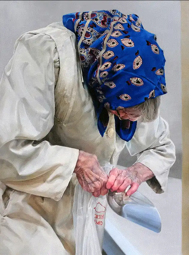
- Ordinary moments that express human universality
- Distinct character w/o showing face
- bright scarf
- oversized trench coat
- fortitude in her old hands, performing a previously simple task
- Age, personality, character, storytelling, visual metaphor
Kinda boring like Dirty Laundry. Identity is abstracted (no face) but everything is a little cliche.
Judging works from a “realist” collection is pretty difficult for me, lol. I am not really a fan of realism. I think it’s kinda boring. There’s less to chew on.
I only enjoy realism if the surrounding composition is abstracted (or at least analogous to abstraction); or if the content is a parody/satire/camp (see Cindy Sherman, Margaret Bowland, etc)—which I guess is the literal made abstract through meaning, rather than through form.
Splinters of a Secret Sky
Angela Fraleigh
Oil on canvas, 2021
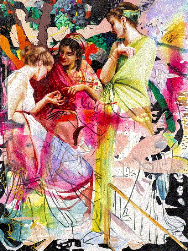
- three figures, different cultures/times?
- different standards of beauty, womanhood, etc
- top half = lavish, well-defined, illustrative, literal
- bottom half = minimalist, deconstructed, abstract, graphic, implied
- idk, this bores me lol
I happened across this painting while looking at the Bennett Collection website and it’s sort of an example of the thing that makes my eyes roll.
Here is the artist statement:
Sourcing literature, art history, semiotics and social theories, as well as my personal narrative, my work questions how cultural narratives are applied, structured and how that comes to shape our experiences in the world. My work is about how meaning gets made. I weave together realism and abstraction in lush and complex works, ranging from intimate portraits to monumental figure paintings that question and re-imagine women’s roles in art history, literature, and contemporary media.
I had to look up semiotics lol. Here is the definition, per Wikipedia:
Semiotics is the study of signs. It is an interdisciplinary field that examines what signs are, how they form sign systems, and how individuals use them to communicate meaning.
I don’t know why I have a kneejerk reaction to stuff like this. Is it some manifestation of implicit sexism? Fatigue with social critiques and theories?
The weird thing is that I love reading about stuff like this (see here for a recent example of my own theoretical commentary). But when it gets applied to art I just immediately—I don’t know the word.
I don’t lose interest, because being put-off by something still conveys interest—just in a negative sense. I guess I just find it tiring. I enjoy these concepts in a textual sense, but when described visually, I feel like they take away from the medium of art itself—at least for me. An artwork is less a work of art and more an excuse to philosophize.
I think these observations have made me more empathetic though. I paused and looked at the painting again. I thought about the title. I guess I tried “analyzing” it according to the artist’s philosophy.
I enjoy the painting in a material sense. It stuck out to me immediately. Upon a closer look, it obviously has all of the elements that I enjoy in art—relationships between figures, the dichotomy between realism and abstraction, bold colors and lines, etc.
So what gives? Why do I feel such an aversion to the conceptual justification for this artwork? What really stood out to me in Fraleigh’s statement was the mention of “social theories”, which in my mind equals identity politics and populism (needless to say I’m not a fan). I guess that’s just my own projection.
The art on its own is cool, but its conceptual basis carries connotations that I’m not a fan of. It’s not that I don’t enjoy political work. I guess it just feels—patronizing maybe? Like, too obvious and broad.
With White Fives, Bowland’s conceptual justification is self-contained within the painting, using the subject of portraiture as a vehicle for ideas on race, beauty, sexism, etc, as they are relayed through the girl’s connection with the viewer.
In this piece, I feel like the women in the paintings are one-dimensional. I can see the notions of race, history, culture, gender, contemporary art versus classical art, etc, at play. Maybe the trouble is that the artist’s conceptual scope exceeds the bounds of the painting, and the painting compensates by providing too much information.
It’s just sort of cheesy in how it hits the viewer over the head with its politics. Like, okay, I get it—three different women of different cultures contrasted against a bright, abstract background which fragments outward from the figures; recontextualizing what appear to be classical depictions of femininity in a post-modern visual smorgasbord. It’s just kind of boring to me and tautological in its approach.
I’ve seen this painting before, is the problem. It doesn’t say anything unique. Its concept is so wide that you can’t pull out any specific message from it.
Maybe I just prefer concepts of a singular, intimate nature versus broad philosophies, which—in my opinion—flatten any artwork you project them upon.1
The most exciting part of the painting for me is the bottom half, when the figures begin to deconstruct into abstractions; make of that what you will. Perhaps the theoretical capacity of an artwork grows the less enumerated its contents are?
For what it’s worth, I could also just be having a clueless patriarchal episode, lol.2
Again Divide the Timeline
Ali Cavanaugh
Watercolor on dry clay, 2013

- back to singular portraiture—smaller scale, intimate, individualized
- minimalist in presentation; intentional in what information is provided to the viewer
- body reads adolescent/post-adolescent—something about youth, or on the cusp of?
- attitude and emotion in figure movement/position—no facial identity or expression to go off of
- pink socks on arms = ??? girlhood? femininity?
- left side = active, in shadow, animated
- right side = calm, light, at rest
- focus on chest? maybe i’m a creep idk, but it is a strong framing device especially with clinging fabric. is it mean to be read into, or am a sexist pig for assuming that a female chest is anything but a bodily illustration, as incidental as the contour of a shoulder? (admittedly, probably the latter)
- lower torso falls away underneath, almost becoming the painting-ground—reminiscent of bust sculpture pedestals, giving a stately/mythic impression to the subject
This piece I find much more exciting to engage with. The artist doesn’t reveal much, only leaving clues and implications; the viewer is made to decipher its meaning with scant information, using their own ideas, history, and identity as reference. Again, there is a subject-viewer relationship, akin to White Fives.
The Conversation
Zoey Frank
Oil on canvas, 2014

- now this is my kinda thing
- formal elements
- spatial composition layout
- material space
- traditional framing devices
- intentional geometry
- use of perspective, foreground, middleground to establish hierarchy
- narrative story
- what are they talking about?
- what is the naked woman?
- what are the relationships at play?
- I don’t care about the literal answers; I just like the implications
- e.g.: naked woman is “facing” the blonde in the white t-shirt; is this some sort of implicit “confrontation”? her posture is rigid whereas the other two are relaxed
- space feels clinical: dull carpet, white walls, empty spaces. gives air bnb vibes. doesn’t feel like a wholly domestic setting. there is unspoken tension.
This painting is cool. I like it a lot. But like I said, I don’t really care about what it’s about—if the artist wanted me to know, she’d tell me. I’m not going to waste my time trying to figure it out.
Maybe that’s callous. But I think that way about art in general. Artists only provide as much information as they are willing to share. Sometimes that is too little; sometimes it is too much.
If there’s not enough information, it’s either on purpose—in which case I’m going to respect that boundary and not read into it—or a lapse in communication, in which case the artist is an ineffective messenger3 and there’s nothing to read into.
How can you tell whether the amount of information in an artwork is intentional or not? I don’t know. I think it just has vibes. There’s a psychological weight behind the imagery and its construction—as is the case with The Conversation.
I think this painting is maybe the perfect example. It’s like looking into a window and watching strangers. You have no idea who they are, where they come from, or what they’re talking about. All you can infer is from what is implied; we connect the dots with our own priors.
Here’s my inference:
- the man is cast in shadow and leaning back, nonchalant or indifferent to his circumstance
- the blonde stands in a pillar of light—innocent, respectable; she affects a lackadaisical attitude, pocketing her hands and tilting her hips—but her stiff shoulders and reticent expression betray feelings of discomfort
- the naked woman in the background—the only figure we see standing fully, surrounded in red—is commanding, dominant, even if we do not see her face; the door is opened, inviting us to look at her body, as if she is some erotic secret
Is any of that interpretation “true”? What’s it matter? We’ll never know the truth anyway.
Continuing with my earlier analogy, the viewer is always outside the window. We are never going to step inside the context of a painting and “hear” what the figures are saying. Only the artist can do that. So to figure out this “conversation” is a futile effort.
But just because we aren’t privy to the conversation, it doesn’t mean there isn’t any communication taking place. We can see that there’s communication between the figures. There’s also communication between the painting and the viewer.
The “conversation” is a static endpoint of content that is best left unsought. It is a dead end; an unsatisfactory conclusion.
Communication is an active process, existing both within and without an artwork. It’s dynamic and always changing. The context is dependent upon the viewer’s relationship with the content—not the content’s relationship with the viewer. 4
It doesn’t matter what you’re trying to communicate. If you wanted to communicate something specific, insulated from interpretation, then you’d write it out—sometimes literally. How many great artworks are literal in their content? Tons! And that’s okay—the artists were intentional in their messaging. If that’s what you need to do, do it—you’ll be in good company.
I just don’t like this weird in-between where artists want to have their cake and eat it, too. Vague visuals are not rectified with meandering thesis statements. If you have something to say, say it; if you don’t, save it. Secrecy is much more enjoyable than post hoc justifications.
Postpartum
Aneka Ingold
Mixed media on paper, 2019

- individual figure; baby is an object more than a subject
- frontal angle but gaze is not focused; looking “through” the viewer
- flesh-toned only at head/face and arm holding child, as well as the child itself
- only areas of personal resonance/identity?
- blue body = dissociation?
- red string throughout—of fate?
- mother/child dichotomy repeated in horseshoe crabs; idk what they signify
- idk what the pink machine is; hooked up to threads; electrical/mechanical monitor/generator maybe?
- balls of yarn = encroaching domesticity?
- bird = idk, freedom or something
I was enamored with this painting as soon as I saw it. I think it is the perfect example of the conceptual balance I’ve been talking about. The title lays it out for us: this is about postpartum depression. So kudos to Ingold for cutting to the chase. But what all of these symbols manifest, and how they come together, will never be revealed to us. I think that’s cool.
Artists put a lot of themselves in their work. Artwork like this is especially vulnerable; and vulnerability makes for great art. But how do you stop from revealing your entire self to strangers? By codifying your feelings, thoughts, and ideas into visual cryptograms.
Ingold provided the context for this piece and left the rest to the viewer. It’s the sort of artwork you can look at a thousand times and always discover something new in it.
I think the most effective conceptual art is work that tells us everything we need to know and nothing we don’t. It provides ample information to make inferences, but not enough to make conclusions.
In the end, the viewer makes the meaning; the artist just provides enough material for them to work with.
That’s it for now! I had a lot of fun doing this. Like I said, I’ll turn this into a blog post eventually. I think I’ll continue analyzing art here and there, too—and give updates on my own conceptual development.
Until then, take care. <3
Footnotes
To clarify: I meant projecting broad philosophies onto artwork that features individual portraiture or a few literally identified figures. In my opinion, I find this level of philosophy is more successful on artwork which is more abstract/less explicit in its content—and thereby more flexible in its accommodation of the theoretical. When applied to individualized subjects such as portraits or, in this case, a group of well-identified figures, it gets tangled up in the particulars of identity and individuality. ↩
But is it necessarily sexist to dislike a work of art because it discusses womanhood and feminism? ↩
I’m definitely being an asshole about this. But I find the whole rigmarole around art so exhausting. Either take a shit or get off the pot. ↩
By this I mean that you can’t control how your content will be interpreted by other people; it’s better to focus on facilitating a connection with the viewer, which you can control. ↩
tags
these are broken until i set up the notebook tags page sorry ;_;